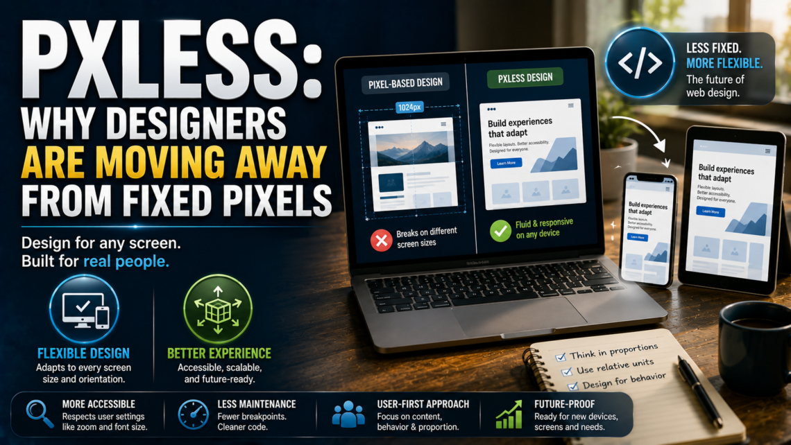
Pxless Explained: Why Designers Are Moving Away From Fixed Pixels
If you have come across the word “pixel” and felt a little unsure what it actually means, you are not alone. It sounds technical, almost like a piece of code, but it is really describing a shift in how people build websites and apps. This guide breaks the idea down in plain language, explains where it came from, why it matters, and how you can actually apply it if you design or build digital products.
What Does “Pxless” Mean?
The word combines “px,” the short form for pixel, with “less.” Put together, it points to a design approach that reduces reliance on fixed pixel values. Instead of setting a button to exactly 200 pixels wide or a heading to exactly 24 pixels tall, a pixel-less approach uses flexible, relative units such as percentages, ems, rems, and viewport-based measurements.
This does not mean pixels disappear from the screen. Every device still renders images and text using pixels at the hardware level. What changes is the thinking behind the design. Instead of asking “how many pixels should this be,” a designer working in a pxless way asks “how should this element behave as the screen, font size, or zoom level changes?”
In short, pxless is less about removing pixels and more about removing rigid pixel-based rules from the design process itself.
Why This Idea Exists At All
To understand why pxless caught on, it helps to look at how web design has changed over the last fifteen years.
In the early 2000s, most people browsed the internet on desktop monitors with fairly predictable screen sizes. Designers could build a layout at a fixed width, test it on a handful of screens, and reasonably expect it to look the same everywhere. Pixel-perfect design was not just possible; it was the standard.
That predictability broke down once smartphones, tablets, and a huge range of screen sizes entered the picture. A layout built for a 1024-pixel desktop screen could look cramped, stretched, or broken on a phone. Responsive web design, introduced publicly around 2010, was the first major answer to this problem. It relied on flexible grids and breakpoints so a layout could reshape itself at certain screen widths.
Responsive design was a big step forward, but it still leaned heavily on pixel-based breakpoints like 320px, 768px, and 1024px. Between those fixed points, things could still look awkward. Pixel-less thinking is often described as the next stage in that evolution: instead of designing for a handful of fixed screen widths, you design systems that scale smoothly across any width, without needing to predict every device that might load the page.
Modern CSS tools made this practical. Flexbox and CSS Grid lets elements resize and reflow automatically. Container queries let a component respond to the size of its parent rather than the whole screen. Relative units like rem and vw let font sizes and spacing scale with the user’s settings instead of staying locked in place. Pxless brings all of these tools together under one guiding idea: design for behavior and proportion, not for a fixed number.
The Core Principles Behind Pixel-less Design
A handful of ideas show up again and again when people describe pixel-less design. Understanding these principles is more useful than memorizing the term itself, because they are what actually changes how you build something.
Content Leads, Layout Follows
In a traditional pixel-based layout, the container size is often decided first, and the content is squeezed to fit. In plexless thinking, the order is reversed. Text length, image dimensions, and the natural size of interactive elements are allowed to influence the layout, rather than being forced into a box that was drawn before anyone knew what would go inside it.
Relative Units Replace Fixed Ones
This is the most visible part of pxless design. Instead of writing a width as “300px,” you might write it as “50%” of the parent container. Instead of a font size fixed at “16px,” you use “1rem,” which scales if the user changes their base font size in their browser settings. Spacing, margins, and even border radius can be expressed in relative terms so the whole interface scales together rather than piece by piece.
Proportional Relationships Over Absolute Values
Pxless design cares about how elements relate to each other. A heading might always be twice the size of body text, no matter what the base size is. A sidebar might always take up a fixed share of the available width rather than a fixed number of pixels. When the relationship between elements stays consistent, the design holds together even as the screen size changes dramatically.
Fluid Layout Systems
Tools like CSS Grid and Flexbox make it possible to build layouts that stretch, shrink, and rearrange themselves without manual intervention at every breakpoint. Functions like minmax() and auto-fit let a grid decide on its own how many columns fit comfortably, rather than a developer hardcoding that number for every possible screen width.
Designing for Behavior, Not Just Appearance
Perhaps the most important shift is mental rather than technical. Pixel-based design tends to treat a screen mockup as the final answer. Pxless design treats the mockup as one possible state among many and spends more attention on how the interface behaves as conditions change: what happens when someone zooms in, uses a larger font size, rotates their device, or opens the page on a screen nobody has designed for yet.
Why Pxless Matters Right Now
It would be fair to ask whether this is just a trend with a catchy name. There are practical reasons it has gained attention.
Screen diversity keeps growing. People move between phones, tablets, laptops, ultra-wide monitors, foldable devices, and increasingly wearables and in-car displays. A rigid, pixel-locked layout struggles to hold up across that range. A flexible system built on relative units adapts far more gracefully.
Accessibility depends on flexibility. Many users rely on browser zoom, larger system font sizes, or screen readers. A design that assumes a fixed pixel size for text can break badly for these users, forcing text to overlap or spill outside its container. Because pxless design is built around scaling and relative sizing from the start, it naturally respects these accessibility settings instead of fighting against them.
Performance and maintenance benefits add up. Pixel-locked designs often need dozens of small overrides to patch problems on different screen sizes. A well-built pxless system needs far fewer special cases, which usually means cleaner code, fewer bugs, and less time spent maintaining old CSS rules.
Future devices are unpredictable. Nobody can say exactly what screen shapes and sizes will exist five years from now. A system built on proportion and relative sizing is better prepared for that uncertainty than one built on numbers chosen for today’s devices.
Common Misconceptions About Pixless Design
A few misunderstandings come up often enough that they are worth addressing directly.
Misconception one: pixel-less means no precision. Some assume that moving away from fixed pixels means giving up control over how a design looks. In practice, a pixel-less design still requires careful decisions about proportions, spacing scales, and typography ratios. The precision shifts from exact pixel counts to consistent relationships, but it does not disappear.
Misconception two: pixels are being removed from the process entirely. Screens still render everything in pixels. Icons, certain UI details, and pixel art still have legitimate uses for fixed pixel values. Pixel-less design is about reducing unnecessary dependence on pixels for layout and typography, not banning them outright.
Misconception three: this is only relevant to large, complex products. Even a simple landing page or a small business website benefits from fluid typography and flexible spacing, since visitors will still load that page on a wide range of devices.
Misconception four: Pixels is a specific tool or library. It is a design philosophy and a set of practices, not a single product you install. Different teams apply it using different combinations of CSS features, and there is no single official specification that defines it.
How Pxless Compares to Traditional Pixel-Based Design
| Aspect | Pixel-Based Design | Pxless Design |
|---|---|---|
| Sizing units | Fixed pixels (px) | Relative units (percent, em, rem, vw, vh) |
| Behavior on zoom | Often breaks or overlaps | Scales smoothly |
| Cross-device consistency | Requires many manual adjustments | Adapts through proportion and fluid rules |
| Accessibility | Can conflict with user font settings | Naturally respects user preferences |
| Maintenance | Frequent breakpoint patches | Fewer special-case overrides |
| Best suited for | Fixed elements like icons, pixel art | Layout, typography, spacing, components |
Neither approach is universally “better” in every situation. Pixel values still make sense for small, fixed details such as icon sizes, border widths, or pixel art. The value of pixel-less thinking comes from applying it where flexibility actually matters most: layout structure, spacing systems, and typography.
Practical Ways to Apply Pxless Principles
If you want to move your own project toward pxless thinking, a step-by-step approach works better than trying to change everything at once.
Start by auditing your existing design. Look through your stylesheets or design files and note where fixed pixel values dominate, especially in layout widths, font sizes, and spacing. This gives you a realistic picture of how much rework is involved.
Define a scale instead of one-off values. Rather than picking font sizes and spacing values individually for each element, build a consistent scale, for example, a typography scale where each size is a set ratio larger than the last, expressed in rem units. Apply the same idea to spacing, using a small set of proportional values instead of dozens of arbitrary pixel numbers.
Replace fixed widths with flexible containers. Use percentages, fr units in CSS Grid, or Flexbox‘s flexible sizing properties so containers expand and contract naturally instead of staying locked at a set width.
Let typography scale with the user. Set your base font size in a way that respects browser settings, and size headings and body text using rem or em rather than px so that if someone increases their default font size, your entire layout scales along with it.
Use modern layout tools instead of manual breakpoints. Features like CSS Gridauto-fit, along with container queries, let components decide how to arrange themselves based on available space rather than requiring you to hardcode a breakpoint for every possible screen width.
Test across real conditions, not just standard screen sizes. Check your design with browser zoom at different levels, with larger system font sizes turned on, and on at least one unusually shaped screen, such as a narrow foldable or an ultra-wide monitor. These tests reveal problems that a simple resize of the browser window often misses.
Keep a short list of intentional exceptions. Some elements genuinely benefit from fixed pixel values, such as small icons or hairline borders. Rather than treating every pixel value as a mistake, keep a clear, deliberate list of where fixed sizing is appropriate and why.
A Simple Example
Picture a card component used to display a product on an online store. A pixel-based version might set the card to exactly 320 pixels wide, with a heading fixed at 18 pixels and padding fixed at 16 pixels. On a small phone screen, that card might overflow the visible area. On a very wide monitor, several of these cards might leave large, awkward gaps between them.
A pixel-less version of the same card might set its width as a percentage of its parent grid column, let the heading size be expressed in rem so it scales with the user’s base font size, and set padding using a relative unit tied to the same scale as the rest of the design. On a phone, the card shrinks to fit comfortably. On a wide monitor, the grid it sits in can simply display more cards per row, using the same underlying rules rather than a special case written just for that screen size.
The visual result might look almost identical to the pixel-based version on a standard desktop screen. The real difference shows up at the edges, on unusual screen sizes, with browser zoom, or with larger system font settings, exactly where pixel-based designs tend to struggle.
Challenges to Expect
Adopting pixel-less principles is not without friction, and it helps to know the common sticking points in advance.
Designers and developers who used to exact pixel control sometimes find it uncomfortable to hand over precision to relative rules and browser behavior. There is a learning period involved in thinking proportionally instead of numerically.
Testing also becomes more demanding. Because a fluid design can respond to an almost unlimited range of screen sizes and settings, thorough testing across devices, zoom levels, and font size settings becomes more important than it was with a handful of fixed breakpoints.
Team communication can also shift. Design handoffs that once specified an exact pixel value for every element now need to communicate proportions, scales, and behavior instead, which can require new habits and new documentation approaches within a team.
None of these challenges are reasons to avoid the approach, but they are worth planning for rather than discovering midway through a project.
Checklist for a Pixels-Friendly Design
- Font sizes are set using rem or em rather than fixed pixels
- Layout widths use percentages, fr units, or flexible container rules instead of fixed pixel widths
- Spacing follows a consistent proportional scale rather than arbitrary pixel values
- The design has been tested with browser zoom at multiple levels
- The design has been tested with larger system font size settings enabled
- Fixed pixel values are used only for deliberate exceptions such as icons or hairline borders
- Layouts have been checked on at least one unusually shaped or sized screen
Conclusion
Pxless is best understood as a mindset rather than a strict rulebook. It grew out of a very real problem: digital experiences are viewed on a wider range of devices and settings than pixel-based design was ever built to handle. By shifting attention from fixed pixel counts to proportion, relationship, and adaptive behavior, pixel-less design offers a way to build interfaces that hold up whether someone is using a small phone, a large monitor, a zoomed-in browser, or an accessibility setting that changes how text is displayed. It does not eliminate pixels, and it is not a single tool you can download. It is a way of thinking about layout and typography that puts flexibility and user experience ahead of rigid, one-size-fits-all measurements.
Frequently Asked Questions
Is pxless a specific software or coding library? No. Pxless is a design philosophy applied using existing tools such as CSS Grid, Flexbox, relative units, and container queries. There is no single official product called “pxless.”
Does “pxless” mean I should never use pixel values again? No. Fixed pixel values still make sense for certain details like small icons, borders, or pixel art. Pxless design focuses on reducing unnecessary reliance on pixels for layout and typography, not eliminating them everywhere.
How is pxless different from responsive design? Responsive design introduced flexible grids and breakpoints, but it often still depends on fixed pixel breakpoints. Pxless design builds on that idea by relying more heavily on relative units and fluid layout tools so a design can adapt smoothly across a wider range of screens, not just a few predefined widths.
Will a pixel-less design look different from a pixel-based design on a standard screen? On a typical desktop or phone screen, a well-built pixel-less design can look very similar to a pixel-based one. The difference becomes clearer on unusual screen sizes, with browser zoom, or with accessibility settings like larger text turned on.
Is pxless only relevant for large websites or apps? No. Even small websites benefit from flexible typography and layout, since visitors load pages on a wide variety of devices regardless of the size of the project.
What CSS units are commonly used in pixel-less design? Percentages, em, rem, viewport width and height units (vw and vh), and flexible layout systems like CSS Grid and Flexbox are the most common tools used to reduce dependence on fixed pixels.
Does adoptingless principles slow down development? There can be a short learning curve, especially around testing across more conditions than before. Over time, many teams find that a consistent, proportion-based system actually reduces the number of one-off fixes needed for different screen sizes, which can save time overall.
Is a pixel-less design better for accessibility? Generally, yes. Because a pxless design relies on relative units rather than fixed pixel sizes, it tends to respect user settings such as browser zoom and larger font sizes more naturally than rigid pixel-based layouts.
Read More: Turaska: Unraveling the Many Layers of a Mysterious Word





One comment on “Pxless Explained: Why Designers Are Moving Away From Pixels”